
I’ve earlier performed a little test, comparing two files: one produced with MS Word, the other with OpenOffice.org Writer. The purpose then was to demonstrate that Word isn’t necessarily such a bad piece of software — it’s just not always used in a way which is likely to give nice results: most people don’t change the default settings of Times New Roman/Arial and ragged right margin, and they apply formatting manually for each new element, which is bound to lead to inconsistencies.
Now it’s time for the next round of tests, this time including another application in the comparison: the “typesetting environment” LaTeX. I will also go more in detail with the points of comparison, not just considering the crude parameters such as font size and page margins, but also taking into account the finer typographical details. In the former test, I had deliberately turned off hyphenation. That led to a discussion about various hyphenation algorithms, and this time, I have decided to turn on automatic hyphenation in all three programs, using the default settings.
The contestants
MS Word probably needs no presentation: the omnipresent causer of headaches over lost or corrupted files; the producer of hoardes of ~WRL2354.TMP files in some hidden system directory (look in C:\Documents and Settings\<User Name>\Application Data\MicrosoftOffice if you don’t believe me); and the single most influential spreader of bad typographical taste in a hundred years, since the previous low point in the late nineteenth century.
OpenOffice.org is the flagship of the open source movement: a free equivalent to Word, which boasts an almost perfect and seamless conversion filter, so that you can edit almost any word file interchangeably in Word and Writer without ever noticing. Oh yes, and it’s free, both as in beer — you don’t pay for it — and as in speech — the source code is open, the file format is open, so you don’t need a particular program to view its files (there are at least three word processors which natively use the same file format, and countless others which can read it).
Both of the “W” programs are so called Word Processors. Some hold that the use of the same word in “Word Processor” and “Food Processor” is no coincidence, and anyone who has been met by a screenful of random characters from a ruined Word file will be likely to agree. They are both parts of huge pieces of software, “Office Suites”, with several integrated applications in addition to the word processor: a spreadsheet program, a presentation program, a drawing program, a database application, etc. The principle is WYSIWYG — “what you see is what you get”. You type a “b”, select bold/italic, and that’s what you see on the screen and on the paper you eventually print out.
LaTeX is a different beast: it is a “typesetting environment” rather than a word processor. First of all, there is no icon on you desktop saying “LaTeX” which you can click on to bring up the LaTeX program. There is no one particular “LaTeX editor” — any editor which can open and save plain text files without messing them up by adding Microsoft’s secret codes at the end, can be used. Already this is a concept which is foreign to most people who have gotten used to the modern point-and-click way of doing things. (True story: most of the people I have sent LaTeX files to, have complained that they could not open them. Here’s lesson #1 today: just because Windows doesn’t automatically know which program to use, doesn’t mean that there is no program to use).
Edit: Judging from the many comments I’ve received about this parenthesis — most of them along the lines of “What kind of an idiot sends LaTeX files to ordinary people?!?” — I think a clarification is in place. I’m referring to a handful of occasions when I’ve needed an author to check some little detail, or a proof-reader to go through a text. I’ve sent them the files — accompanied with PDF files — along with instructions to disregard all the \command{this} and \environment{that} rubble. I don’t expect them to install some tex variant and process the file, just to be able to open it, since it’s simply a plain text file. These are people who think that word files live in Word and that it must be the same way for all other kinds of files too.
In fact, LaTeX is much closer to being a “Text Processor” than the other two, it just does the processing much better: You feed it some raw materials, and out comes, not scrambled eggs, but a whole pie complete with chicken and cheese, pefectly seasoned and baked precisely long enough to give it a nice crispy surface without getting burned.
It fills the outer limits of the area where word processors occupy the middle ground. The “raw material” in this case is text which looks like this:
\noindent\lettrine{I}{t is easy} to be seduced by Dylan's lyrics:

\textit{they} were essential when he was nominated for `Voice of a

Generation', and \textit{they} stuck in the fans' throats when he converted
It may look cumbersome, and it is, but the reward comes when you process it and print it out. It then becomes clear why it’s called a typesetting environment: LaTeX is in fact a tiny little typographer, trained by Gutenberg (he’s very old now) and still upholding the craft with pride. A Word document may look nice on the screen, but no publisher with any self-respect would ever publish a book directly from a word file.
The document
Layout in Word, Writer, and LaTeX (pdf file)
For the test, I have used two pages from an upcoming chapter from Things Twice — the book. I have tried to the best of my ability to use exactly the same layout in all three programs. In theory, this is just a matter of writing down settings in one place and applying them in the other, but in practice, it is slightly more involved. In Word, the header and footer are not considered to be part of the page area: if you want the header to start 3 cm down on the page, you will have to indicate a 4 cm upper margin and a 1 cm header, which is a strange way of dealing with the page layout parameters, and one which can cause quite a lot of frustration and trial and error. But those problems aside, I have used a page area of 12x18cm, a font size of 11.5/13.2pt (i.e. 1.7pt leading), a three-line drop cap for the first paragraph, and a slightly stylish, book-type of chapter heading. The font is Adobe’s Garamond, the most beautiful font in the world.
The pdf file contains the following four versions:
- MS Word
- OOo Writer, produced under Windows.
- OOo Writer, produced under Linux.
- LaTeX, produced with tetex, under Linux.
So how do our contestants fare?
At first sight, all the versions seem pretty equal, which should not be surprising, since all the brute settings are the same. The page number on the front page is a little lower in the Word Processors, but that’s because of an oversight on my part, not because of intervention from the programs.
But let’s look a little closer.
Small caps
The first major difference appears in the subtitle. It is set in small caps. Small caps are a separate set of characters where the lower-case letters have the same shape as the upper-case, but the same size as ordinary lower-case letters. Most fonts don’t contain any small caps. If they exist for the font in question, they are usually supplied in a separate font file, but neither Word nor Writer can handle them directly. Instead, they take the capital letters and scale them down. This may seem like a good idea: why double the work? but there are some problems, which the W/W versions show.
There is no fixed proportion between upper- and lower-case letters. Some fonts have high ascenders (the long lines in letters like “k”, “l” or “M”) and a small “x-height” (the height of — you guessed it — a lower-case “x”); others may have shorter ascenders and bigger “x”s. But a word-processor has to make some choice, and Word has chosen to let the lower-case small caps be 80% of the upper-case letters, whereas Writer uses c. 66%.
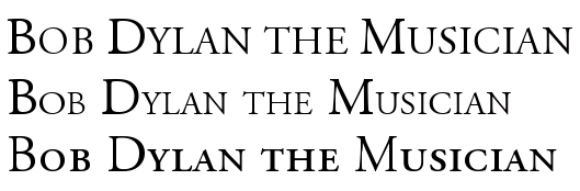
Figure 1: Small caps in Word, Writer, and LaTeX
In this particular font (Adobe Garamond), the ratio between upper- and lower-case small caps is almost exactly the same as in Writer, and one would think that Writer’s version would therefore look good, but it doesn’t. Why? Well, all letters in a font are designed to look good at their correct size, next to their neighbouring characters, but when they lose one third, the lines become way too thin. They stand out as the only element on the whole page with a different “colour”, the typographical term for how the ink is distributed on the page. It is apparent in the subtitle, but it becomes even more painful in the first couple of words, where the fake small-caps look like starved post-war kids next to the healthy regular letters.
Word’s solution is slightly better, but it has its own problems. First, the difference between upper- and lower-case letters is so small it is almost negligible. And secondly, together with regular text, the lower-case substitutes become much too big. This may be a minor problem since their function is to stand out from the rest, but the combination “too tall and yet so skinny” is forgivable in a teenager but not in a full-grown office application.
Now turn to LaTeX, which uses the characters which are designed specifically as small-caps. Notice the color: it’s the same as the rest of the text. There is a clear difference between upper and lower case, and although the letters are about the same height as Writer’s “small-caps”, they look infinitely much better, because the lines haven’t lost a third of their weight.
Latex: 3, Word: 2, Writer: 1
Numerals
While we’re on the subject of letter shapes: a proper font should contain proper numerals, but most don’t, at least not in places where simple programs like Word can find them. The number shapes in the two Word processor files are fine for tables, phone books, and math exams, but they are not designed to be part of a running text.
What you will find in a book like this, is the shapes in the LaTeX version. This is not because the LaTeX font is different from the one W&W use (in this respect; in many other respects it is), but because Latex knows where they are and you can order it to use them. W&W only knows about one set, and uses that. (In the Writer-Linux version, I have used a version of the font where I have moved the nice typographical characters to the place where tabular ones, which I will never want to use, are usually found.)
Latex: 3, W&W: 1
Ligatures
But wait: there’s more. Some letter combinations are more difficult than others. The letter “f” is particularly troublesome, and therefore, there’s a long tradition — back to Gutenberg, actually — of making special characters for the combinations “fi” “fl” and “ff” (and “ffi” and “ffl”) — so called ligatures. Most fonts actually have these, but again, W&W doesn’t use them. This is a consequence of the WYSIWYG paradigm: in order to produce the same output on screen as in the finished file, the word processor will have to change two characters — “f” and “f” — into one — the “ff” ligature — on the fly, and be ready to change that again into the three-character ligature “ffi” if the next input is an “i”. With today’s processing power, this should not be a problem, but when these programs were born, this would have slowed down the process too much, and a 600-year long tradition of typographical cleanliness was thrown out the window (example; left side).
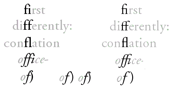
Figure 2: Ligatures in Word (left) and LaTeX (right)
For LaTeX (right side), this is no problem, since the input and the output are two different processes. With all the visual pollution in today’s printing world, it may seem a small thing, but once one has gotten used to seeing niceties like the italicized “ffi” in “office”, one cringes when one sees the crash site that W&W can sometimes produce.
And while we’re on the topic of crashes: have a look at the last example: italicized “of” followed by an upright parenthesis: of). It is almost bound to create a mess. Word certainly does, with the linux version of Writer close behind. Strangely, the Windowpeoples version has a better solution, but still with a clash. Again, LaTeX is the winner, with a clear separation between the characters.
EDIT: It has been suggested to me that MS Office 2007 has the option to enable typographical numerals and the ligatures if the font provides them. When the article was written, I didn’t have access to the new beast from Microsoft. Now I have, and if this is in fact featured, I haven’t been able to find out how. A default document still prints out like in the images above.
“Badness”: laying out lines and paragraphs
These are all nice details having to do with how to deal with characters. But the greatest difference between the two word processors and LaTeX, is in the area of paragraph and line formatting. Most word processors adjust the inter-word space line by line, by filling up each line as much as possible. But what if the next line ends with some indivisible, long words? In that case, the line-by-line approach becomes doubly bad: the second line will have big holes — bigger than necessary, even — and the contrast between an overstuffed line and a Swiss cheese line is a death-blow to even page colour.
LaTeX takes a different approach. Instead of fixing the lines, which are just random segments of text, the whole paragraph is considered, and if a problem at the end of the paragraph can be solved by dividing a word differently in the beginning, then that’s what will happen. This prevents the problem with one tight line followed by a loose.
There are some examples of this in the example text. None of them are catastrophic, but at least they illustrate the problem. In the second paragraph, W&W hyphenate “atten-tion”, cramming as much of the word as possible into the first line. But at the end of the next line, there is the word “meaningfully”, which cannot meaningfully be split so that any part of it will fit on the second line, which must end with “cannot”, leaving a number of holes in the line. LaTeX, having looked at the whole paragraph before making a decision, knows this, and divides “at-tention”, in order to distribute the extra space more evenly.
The same is the case in the next paragraph, where there would have been room for the whole “performance” on the third line, as Word has done, but that again gives holes, which LaTeX avoids by dividing “perform-ance”. Writer has somehow managed to get one more word into the fourth line, but there are lines with holes later on in this long paragraph, and they may have been caused by the zealous space-saving earlier.
In LaTeX jargon, this is called “badness”. If LaTeX comes across a paragraph which it cannot divide in any good way, it will give a warning, in effect saying: “as the text now stands, this is impossible to make nice. Do something! Rewrite!”. This is a tremendous advantage: when one has compiled a document, one gets a list of the places where there are “badnesses”, which one can then correct manually. I have edited books of 3–400 pages, and the ability at a glance to review all the dubious places is a time-saving miracle — on top of the comfort of knowing, when all is corrected, that you (i.e. LaTeX) haven’t overlooked anything.
Hyphenation
Hyphenation is a necessary evil: it maintains the flow of the line at the cost of breaking a word in two. There is also the danger of splitting at wrong places, because hyphenation does not always follow strict rules.
The hyphenation points chosen by the three programs are all ok, as far as I can judge. Word has followed the American practice of disregarding the original meaning of compound words, giving beauties like “bi-ography” in the last paragraph, and also the horrible “danc-ing” on the middle of that page. But both are allowed, so that’s ok.
LaTeX has been instructed to follow the British English rules, and so we get “perform-ance” instead of “perfor-mance” on the first page. The only dubious decision is “signific-ation”, which according to Merriam-Webster (with US rules) should be “sig-ni-fi-ca-tion” and according to Oxford Advanced Learner’s Dictionary “sig-nif-ica-tion”. So we actually have an error… The explanation may be that the other “signific-” words, “significant” and “signification”, split after the “c”.
Writer follows LaTeX concerning “signification”, but other than that has unproblematic decisions.
“Uncials”/Drop caps
The first paragraph begins with a drop-cap, an initial covering three lines. All three programs do it slightly differently.
Writer’s “I” is too big; it breaks the square of the text area. Word’s is better: the top of the “I” aligns with the height of the ascenders, which is acceptable.
One thing to keep in mind concerning drop-caps is that the magnification of the letter also means that the space around it grows, and with some letters, this may call for some manual adjustment of the position of the letter, so that it will look right instead of being mathematically right. An “O” will look smaller than it is; “A” and “W” have limbs sticking out in various directions, which may trick the eye, and so forth. In other words: there must be an option to fine-tune the size and position of the initial letter. Both Writer and Word give you the option to adjust the space between the letter and the rest of the text, but nothing more than that. LaTeX, on the other hand, lets you configure everything. In this example, I have increased the size of the “I” by a fraction — mainly because I could…
Points and space
I have to confess: I have cheated — on one point. The ellipsis points at the end of the first paragraph — they didn’t have to end up being separated from the “cetera” to which they belong. I could have inserted a hard space between the word and the dots, but I didn’t, for two reasons. One is that most people don’t: either they type word–space–three dots, which the program may or may not replace with the “ellipsis” character (consisting of three dots, but as a single character), or they insert the ellipsis character themselves — after a space. And the result may be as in the W&W versions.
The other reason is to get a chance to illustrate one further point: regardless of how one deals with the ellipsis in the word processors, it will stand out, some way or another. Use three dots, and they will come too close together. Separate them with a space, and they will come too far apart. Use the single-character ellipsis, and things are slightly better, but the three dots are still closer together than the surrounding spaces. This will only get worse if there are extra holes in the line owing to bad paragraph justification.
The LaTeX dots remedy all these problems, because they neither use a fixed character, nor dot-space-dot-space-dot, but something in-between: single dots, separated by a fixed space, less than a full space. In this case, I have even adjusted the space to my liking, both between the dots and the distance to the previous word.
The same can be said about the troublesome title of the Hymn of a Generation, ‘The Times They Are A-Changin” with the two apostrophes in a row. It’s bound to be ugly whichever way one treats it, but one can get decent results. For the LaTeX version, I have used a 1pt space. I could have done something similar in the other versions, but I didn’t, again because it’s not what the default user — or even the advanced user — would do. I’ve used a normal space, which is too much.
Verdict
Time to sum up the evidence. I think I stopped handing out point at some point, but that doesn’t matter: I can form a verdict without them.
If the visual output is the decisive criterion, there really is no competition: LaTeX wins on all counts. Word and Writer follow on a respectful distance: they both fulfill the most basic tasks reasonably well, but fail flat out on others. Word has a slight edge because of the nicer small caps and the drop-cap, but the difference between Word and Writer are negligible; and on other points, such as the italicized-f-plus-end-parenthesis, Writer wins, so let’s call it a tie.
This short example has of course only scratched the surface of what the three applications can do. Because of the integration with the other elements in the office suits, Word and Writer can handle embedded spreadsheets, drawings and diagrams, and similar effects, and including images is very easy, but once you try to place them where you want them on the page, the result tends to be horrible. LaTeX is the industry standard for mathematical formulae, places images where they should be, and can do just about anything with a paragraph (try to make a justified paragraph with the last line centered in Word…). All in all, it is probably fair to say that there are few limits to what you can do in any of the three alternatives if you know them well, but LaTeX always produces the best results.
Another strength of LaTeX lies in the handling of large documents, where the separation of editing and processing can be a lifesaver. I’ve had 400-page documents crash in Words more times than I care to remember, and the final stage of producing such a book is a desert journey on the verge of a nervous breakdown both for the author and the computer. Not so with LaTeX: no matter how long the text is, since it’s “only” plain text, and all the heavy formatting lies outside of the document, the concrete interaction with the text is always unproblematic. Behind the scenes, the same paragraph for which I gave the LaTeX code initially, looks like this in Writer:
<text:h text:style-name="ChapterNumber" text:outline-level="1">Chapter 10</text:h><text:h text:style-name="ArticleTitle" text:outline-level="3">The Uneven Heart</text:h><text:p text:style-name="ArticleSubtitle">Bob Dylan the Musician</text:p><text:p text:style-name="Standard"/><text:p text:style-name="Standard"/><text:p text:style-name="BodyTextDropCap">I<text:span text:style-name="T1">t is easy</text:span> to be seduced by Dylan’s lyrics: <text:span text:style-name="T2">they </text:span>were essential when he was nominated for ‘Voice of a Generation’, and <text:span text:style-name="T2">they</text:span> stuck in the fans’ throats when he converted to Christianity. Equally easy is it to question his musical abilities: ‘He can’t sing’, ‘he can’t play the harmonica’, ‘he only knows three guitar chords’, ‘his lyrics are good, but I can’t stand the voice’. Et cetera <text:span text:style-name="T3">… et cetera …</text:span></text:p>
Since the program has to deal with all that, constantly, a long document can become a huge workload.
That said, writing in LaTeX isn’t a bed of roses. It can be a hassle to get anything other than text into the document; looking at the extra code all the time is a nuisance; setting up the basic document properties, which is done with a couple of clicks in W&W, can be a long process with a manual in your lap; there is ample room for error to sneak into the code (and it is code; writing in LaTeX is a kind of programming).
For anything but short memos, all this is outweighed by the beauty of the final result. But this isn’t even the main reason why working with LaTeX is such a thrill. It has to do with control, with the difference between having a program which invites you do what you want, and one which you must frequenly fight to make it yield to your wishes if you wish anything which goes beyond the defaults. It is easy to produce good results in Word, but it’s hard to produce anything that’s better than good. In LaTeX, it’s the other way around: it’s cumbersome to get even to the default result, but once you’re there, it’s great, and from there to the truly magnificent specimens of typography it’s just a series of small steps.
It’s not having defaults that’s the problem with Word — in fact, LaTeX is nothing but a huge set of finely tuned defaults — it’s the assumption that you are and should be happy with that. It’s the difference between empowering you and crippling you.
Thanks for the thorough comparison. And I have to second you on Garamond: it is by far the best, followed by Palatino and Minion in my opinion.
Could you please tell us how you made use of Garamondin LaTeX?
EDIT: A much better procedure is to ditch plain LaTeX in favour of XeTeX, which can handle any font your system knows of, without all the hassle described in the comment. See the wikipedia article on XeTeX for details.
Sorry for the long delay. I had to move the blog…
Anyway: First of all you need a licenced set of the font Adobe Garamond Pro, the type1 version, with all the different types of files (.afm, .pfm, and .pfb). Then go to http://www.ctan.org/tex-archive/fonts/metrics/w-a-schmidt/ and download the file called pad.zip. That contains everything you need to convert the type1 files to proper latex font files, including detailed instructions. The most tedious part is renaming all the files and putting them all in the right location, but it’s worth the effort :)
Exactly where that “right location” is will depend on how your version of latex is configured. I put them in ~/.texmf-var, for what it’s worth.
Thanks for the very readable article. For people were intrigued by the article and want to try LaTeX: have a look at http://www.ctan.org/starter.html .
First instance of “loose” should be “lose”.
Thanks. Corrected.
Have you tried lyx? Do you have an opinion on it?
Yes, I should perhaps have mentioned it in the article. I think it’s a very nice frontend to LaTeX — very comfortable to work with, and nicely customizable. If you just use the standard classes or some of the included templates (article, book, various letter types, memoir and koma templates, etc.), you hardly need any other LaTeX editor. You have the convenience and visual cues of the word processor combined with the underlying expertise of LaTeX. If you have special needs for the preamble, that is also easily catered for. There is a nice outline panel, and you can view the source code directly if you want to.
When I have been reluctant to use it in my day-to-day work, it is for two reasons. One is the editor part. I have come to expect the versatility and power of vim in dealing with text: moving around, selecting, find/replace — the kind of functions that simplifies work, also for a non-programmer like me. Here, LyX has more or less the same crippled sub-set of functions as the other word processors: no search with regular expressions, a primarily mouse-based interface with keyboard shortcuts which mostly are just menu accellerators, etc. It’s fine for writing text, but less adequate for working with it.
It might have been nice to be able to open the LyX files in vim, but that’s my other objection: the files that LyX works with are barely human-readable, and they are not plain TeX, but a format of its own. Sure, one can export to and import back from LaTeX, but it’s cumbersome, and it’s not entirely seamless.
But for the kind of things where most people use Word, I’d definitely go with LyX instead. Highly recommended!
I like the Latex output, but it always poses difficulties when I want to do anything out of the ordinary. I have to ask people online how to do things, because it seems there is no good knowledge base other than other users. For instance, I wanted to create a 3-column table with differently sized columns. Easy in OO and Word, but hellish in Latex. Also, Latex’s default spacings are not what is often needed. Vertical gaps before & after enumerated lists may be a problem. So, although I think Latex is a good idea, I think it needs to be properly supported so that out of the ordinary needs find an answer quickly.
Just a note, you spelled “application” “appliation”.
“diefference” needs correcting…
Thanks for the article. Kerning would be another one I would cover.
Cheers.
You should try Pages: http://www.apple.com/iwork/pages/
Its output is pretty close to that of LaTeX… and all that without all the font conversion pain.
i’ve never heard of latex …
guess i need to check it out …
worked nicely for you …
Thanks; great article!
As a researcher, I’m a longtime fan of latex. Basically, ’cause I don’t want to be distracted while I’m writing by seeing *what the darn thing is going to look like.* With Latex, I know it’s going to look good. And I can always view it with a couple of keystrokes.
Sigh. As a CS researcher at a national lab, a few months ago my PI told me that I *would us M$ word* to write my article (note, I was the first author). I thought this was so much bullcrap, I never wrote it. Now that my PI has left the lab, I’m happily writing again.
Moral: those who can use Latex. Those who can’t become project leads.
Thanks for listening, I’m off my soapbox for now :)
Latex rocks! – Dave
Those of you who use linux can use Lyx, a WYSIWYG program for formatting and entering LaTex text. It’s not exactly a word processor, but it’s vaguely similar — and offers the advantage of a nice GUI with many formatting options similar to what you find in professional page layout programs. Best of all, it’s free.
Good article, thanks.
Lyx is available for Windows as well, and is a nice middle ground between W(riter)(ord) and LaTeX, though it does require a bit of a paradyne shift.
Grammar Troll comment: second sentence in section The Documents should read “as well as possible”.
Hi, I’ve dipped into the LaTeX world sometimes, but I was always hugely put off by the encoding mess and failure to support OpenType fonts. Ideally we should be able to use unicode and let OpenType features do the work for us. Anyone know if LaTeX is moving into the 21st Century with regards to unicode/opentype — I would be *very* happy if it has/was…
Sorry to answer myself, but it looks as if the last year has been very kind to modern text/font systems in LaTeX:
http://scripts.sil.org/cms/scripts/page.php?site_id=nrsi&id=xetex
Look forward to playing with this…
Aside from Latex, there is also Lout – similar idea (formatting mark-up right in the text), but IMHO more coherent, more compact and easier than Latex. Drawbacks are smaller user base and fewer tools (e.g. conversion to HTML, DocBook). It comes with very good documentation straight from the horse’s (i.e. main developer’s) mouth – well worth checking out.
Thanks for this article, I’m definitely bookmarking it for reference the next time someone asks me why I go through all the “trouble” of using LaTeX rather than a WYSIWIG word processor.
nick b. is correct that iWork’s Pages word processor does some better typography than Word and Writer. In particular, it will apply Garamond Pro and other fonts’ ligatures by default, however it does not appear to format paragraphs to minimize total “badness” like TeX does, and lacks quite a few of TeX’s other best features as well. The deal breaker for me, though, is that Pages doesn’t provide support for inline equations, making it useless for my line of work – this is one of LaTeX’s real strengths, and it is the reason I started working in TeX to begin with.
In my experience Pages is even worse than Word or Writer at handling large documents. Even at 20+ pages it has serious difficulties.
I haven’t tried the latest Pages, though.
Hi,
very good technical article which sparked my interest in LaTex and TeX. BTW, I was much intereste din GNU Documentation Format known as Texinfo. Have you any thoughts on:
LaTex vs Texinfo
:)
OOPS! … I forgot to mention that you are responsible for destroying the friendship of “arnuld & Word Processors”
;)
I’m very sorry for that — my apologies… As a matter of fact, word processors aren’t necessarily that bad. A follow-up article will be called “Who’s afraid of WYSIWYG?” where I will tear apart the arch-argument against WYSIWYG editors: that they blur the distinction between style and contents, and, conversely, that writing LaTeX code in a plain text editor will help you concentrate on the contents and not worry about the style — which is utter BS. Try to concentrate on the contents in the maze of tags and braces that an average LaTeX file is…
I know, I’m speaking with two tongues here. I do so mainly out of irritation: that W&W don’t use the options that are there, e.g. in the fonts (for the most part); that they don’t come with a proper editor (one might have thought that that would have been the first thing that a Word Processor would do — let you edit your text efficiently); that LyX uses its own format on top of LaTeX so that it is not really a LaTeX frontend; that the LaTeX fanbois are so stuck in their “concentrate on contents and not style” line that they can’t see that style is also contents (e.g., if I see a line in bold (style), I know that that’s a heading (contents), and that helps me organize my thought and my writing); etc.
An option which may be useful to keep the best of both worlds, is to use OOo for the writing itself and then export to LaTeX and do the final editing and printing there. This can be done directly with the latest version of OOo, or, if you want more control, with the excellent tool writer2latex. I do this quite a lot. The only problem is that there is no way of doing a clean round-trip conversion: you can’t easily go back to OOo again once you have done any editing of the LaTeX file.
Oh well… Some people are never satisfied, are they…
First: Thanks for the test.
You don’t say if you have used latex or pdflatex, though. And if you used pdflatex, I believe you used an older version (since you used tetex). Could you repeat the latex test with pdflatex from TeXLive2007 and use the microtype package? It will really blow the contestants to pieces… :-)
I used latex, that is true. I’ve since upgraded to TeXLive, and I can confirm that the results are even better with the microtype package. Thanks for the tip!
I can’t easily upgrade the test itself, since the paper is work-in-progress, and it has progressed since then and stupidly enough I haven’t saved the files in the version for the example. But I will make another two-page sample for comparison.
How do you do Drop Caps in LaTeX?
Use the Lettrine package:
http://www.ctan.org/tex-archive/help/Catalogue/entries/lettrine.html
Thanks
Nice Site!
Any experience with LaTeX to HTML conversion?
LaTeX will be worthy addition to the skills I’m planning to build up in the coming year. I always wanted to know about book making and this has come just in time when I’m helping a friend create a manual.
Thank you.
I have heard of LaTeX a number of times throughout the years. I found this article very interesting, but I had trouble with the pdf link.
Could you please repost the comparison pdf? Thanks!
-Mike
Michael: Pandoc ( http://johnmacfarlane.net/pandoc/ ) is a very cool Swiss Army knife sort of application. It can convert between *many* different formats.
And ‘latex2html’ is perhaps the canonical way to do this: http://www.latex2html.org/
Whoops, browser mishap. :-)
Thanks for the article
“letters.Most” should be “letters. Most”.
I’ve never been able to get over the learning curve for LaTeX (I tried LyX for a while too), when all of my meaningful communication occurs over the web. Bad for typography, much better for communication.
I’d like to mention other typesetting packages, for those interested in alternatives to word processors:
– troff (http://www.troff.org): the typesetting package developed at Bell Labs by the people who brought us Unix. If memory serves, the first Unix system was set up to process patent applications, and troff was developed to typeset the documentation. (My first Real Job involved typesetting manuals for SCO using troff.)
– groff (http://groff.ffii.org/): the portable, freely-available troff clone from the GNU folks.
– cl-typesetting (http://www.fractalconcept.com/asp/cl-typesetting): a typesetting package written in Common Lisp.
– I think there’s another typesetting package written in Scheme or CL, but its name escapes me at the moment.
If you want Unicode and OpenType, use XeTeX or LuaTeX, preferrably not with LaTeX, but ConTeXt.
Unfortunately ConTeXt lacks documentation, but it’s the future. And for those who know to use it already the present for some time.
see contextgarden.net
Good job, Eyolf.
For a similar comparison with downloadable examples, considering typographical differences between Word and XeTeX, you may want to look at: http://nitens.org/taraborelli/latex
For those interested in advanced OpenType typography in a TeX environment, I’d strongly recommend XeTeX with the fontspec package which, as I point out in the document above, provides a very comfortable user interface to the most common OT features (on top of full Unicode support, which is essential for non-Western users). Microtypography similar to pdfTeX is unfortunately not supported in XeTeX as yet.
As for ligatures (and kerning!) I confirm that they *are* supported in Office 2008, but disabled by default, which makes them pretty useless. Moreover, long documents rendered with ligatures randomly crash the application (I run the Mac Office version on Leopard), which suggests that support for these features is still, let’s say, ‘experimental’.
It’d be great to see a comparison between *TeX and Adobe InDesign in typographical rendering if anyone is familiar with both.
There is a rather nice specialized editor in the Debian repos which is called Texmaker. The project website is at http://www.xm1math.net/texmaker
It is not WYSIWYG but has menues from which you can quickly click together a preamble, insert formulae, run a test-built etc.. It lacks the power of Vim as far as manipulation of large chunks of text is concerned and it is a bit mouse-centric. So my workflow mostly looks like this:
Use Texmaker to click-produce a preamble and then shove it over to Vim for the heavy lifting.
I tried the LaTex plug-in for Vim, but that did strange things to the editors behaviour.
Very nice article. I always knew LaTeX was technically superior to most other typesetters/word processors because people that knew about typesetting had told me so. I never really had any objective evidence to back that up but now I do, so thanks!
Being a programmer I have always felt much more comfortable editing markup with a text editor (be it HTML or LaTeX etc.) than using some WYSIWYG program. I do not think LaTeX is just for programmers, though. It may seem daunting at first to newbs who have never used a text editor before, but it’s really not that hard especially if you do use something like LyX.
I recommend using GNU emacs with the AucTeX package for editing. Like some other LaTeX editors it has the ability to “fold” the LaTeX markup (ie. all the braces and backslashes) and also to view the entire document in an outline view. This really does allow you to concentrate on the content with all the style hidden until you need it. The advantage of using emacs rather than other specialised LaTeX editors is that you can use emacs for everything and become extremely intimate with your highly tailored and tuned text editor.
I agree that LaTeX can be a more powerful tool, and even a user-friendly one if you use a good front-end such as LyX. I did a comparison of LyX and Word at http://www.noteforge.org/2009/03/microsoft-word-2007-vs-lyx-162-for-math.html , but mostly from the ease-of-use-in-class perspective. I’m glad to see that there are many obvious typesetting advantages to LaTeX as well.
Concerning your edit about ligatures in Microsoft Word: The use of ligatures (it seems to be only common ligatures and not rare ligatures, alternative glyphs, or any inner contextuals) is available in the Mac version (Office 2008) only. Saving this file generates a warning that the ligatures will be unavailable in _all_ previous versions of Word and replaced by standard characters. I realize this article was written a hundred fortnight ago, but wanted to clear up the confusion in the article.